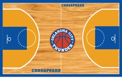
The Oklahoma City Thunder we decided to keep it very very simple, but with the same colour concept. The thunder bolts on the side added quite a bit because it felt like that part of the logo really tied everything together. Also for the font we wanted to use something very simple and bold.